
A random gripe re football unis - Printable Version
+- The CardBoard (https://thecardboard.org/board)
+-- Forum: C-House! (https://thecardboard.org/board/forum-4.html)
+--- Forum: The CardBoard (https://thecardboard.org/board/forum-5.html)
+--- Thread: A random gripe re football unis (/thread-19985.html)
+- The CardBoard (https://thecardboard.org/board)
+-- Forum: C-House! (https://thecardboard.org/board/forum-4.html)
+--- Forum: The CardBoard (https://thecardboard.org/board/forum-5.html)
+--- Thread: A random gripe re football unis (/thread-19985.html)
Pages:
1
2
RE: A random gripe re football unis - Mick - 07-04-2020
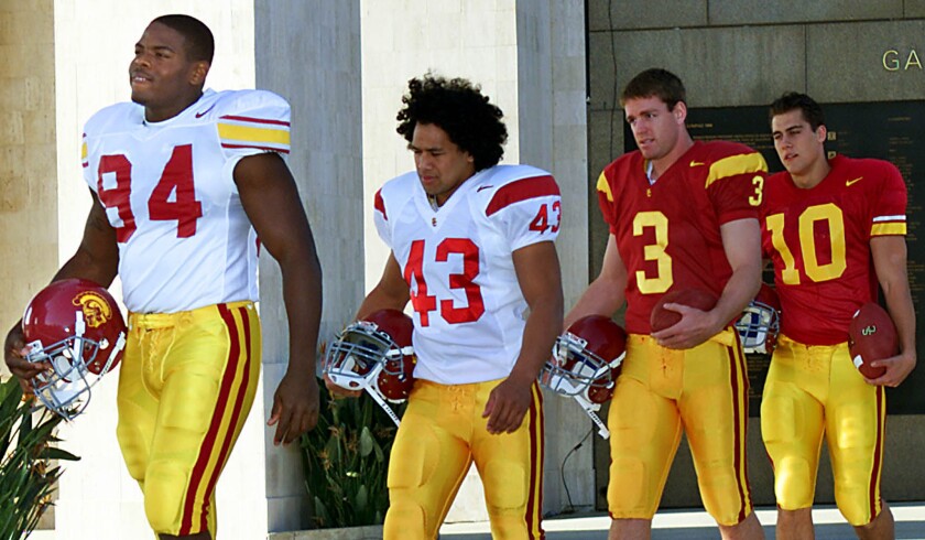
So which of these do you prefer? In what order?
USC


RE: Leftcoast - SamuelMcF - 07-04-2020
(07-04-2020, 10:32 AM)Leftcoast Wrote: Is this the objectionable uniform?
They look simple and clean to me other than the attaboy axes on the helmets. I save my outrage for travesties like the gray on gray alternate uniforms of the Wake Forest/Luck game.

I always wondered why we do Axe stickers on the helmet. That's not a new thing, either; I vividly remember Andrew Luck rocking a helmet-ful of those bad boys. IIRC Harbaugh started the helmet sticker system. My question isn't why helmet stickers (I totally get that), but why use the Axe in particular? For instance, Michigan State does Block S stickers and famously Ohio State does the buckeye leaf. So why not a red Block S or a redwood tree (instead of the tree in the block S logo)? Anyone know?
RE: A random gripe re football unis - pefloresjr - 07-04-2020
These photos have clarified for me one of the reasons I prefer last year's uniforms with the thin black line around the numbers. I wrote earlier that the unlined numbers look like practice jerseys to me, meaning they look kind of cheap. I have always felt that way about USC's maroon jersey with the gold numbers. The reason they look cheap is that they are clearly just silk screened on like cheap t-shirts. The true traditional jersey style had sewn on numbers and letters, like the nice baseball and hockey jerseys that are worn by the players. The addition of the thin line on the Stanford numbers makes them look a little like real sewn on numbers of true old-school jerseys. The lines around the Utah numbers are too big and look clunky. The Stanford jersey looks like a finished, high quality jersey to me.
Also, in the photo of the team, the line is barely visible, just the way the sewing line would be. Perfect.
Cheers,
Pete F.